It’s only recently that web designers have caught up to something book designers and typographers have known forever—lines of text that are too long or too short are hard to read.
If you notice that people (or you!) are having a difficult time reading something you’ve designed or typeset, check out the line length.
Line length is the distance between the left and right edges of a text block. Optimal line length, in print or on the web, is 50 to 75 characters. There are some who say 95 characters is OK, but I think when you close in on 80 characters or higher, you’re going to have readability issues and you’d better have a good reason for violating the rule.
Why Does Line Length Matter?
All of us look for ways to conserve energy, especially mental energy. Lines that are too long or too short make the reader work too hard to understand the text.
With lines that are too long, our eyes and brain get tired as we slog our way through the line. There is a jump in subconscious interest when we go to a new line, but that wanes as we slog our way again to the end of the line. It’s also difficult to continue to the correct next line—it’s so far away from where the line ends, we have trouble tracking our progress and sometimes have to use a finger, pen, or stylus to find our way back and down to the right line. You’ll also find the size of the type in long lines is often too small for good readability and may cause squinting.
With lines that are too short, we’re making that jump to the next line quickly, stressing ourselves and making our brain start the next line before we finish the one we’re on. These short lines cause missed words, confusion, and rereading. Especially with justified text, you often also have bad gaps between words that add to the visual confusion.
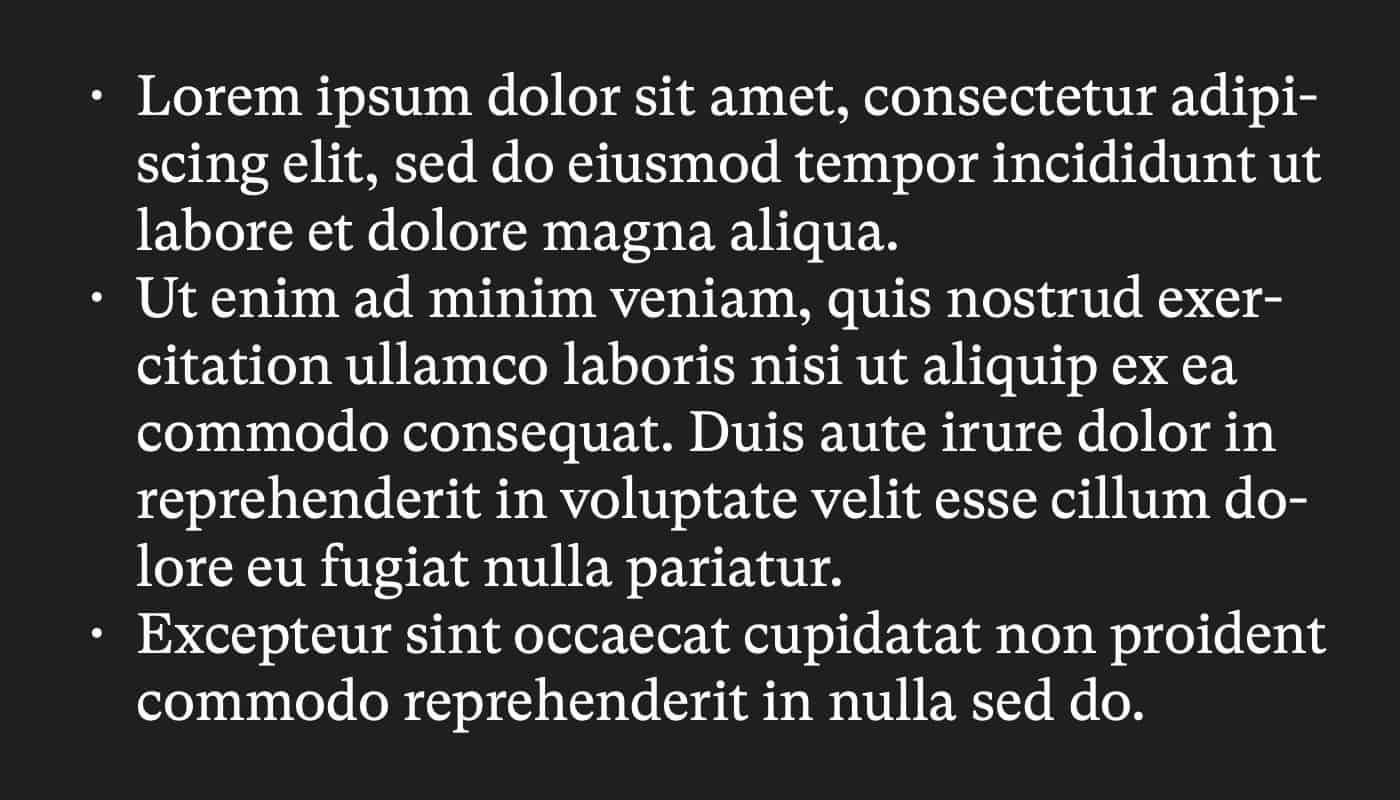
(You can do your own confirmation of this by playing around with font size in your text editor. Use lorem ipsum or other random text and adjust the type size up and down. Count the characters and notice when the type becomes less readable. Make sure your type is justified for the full effect.)
When you add work to reading, people tend to move on to something less taxing. Conversely, text that’s truly easy on the eyes will help attract readers and retain their attention.
You can see designers making their text more readable online by adding padding (print people call that “margins”) and reducing the width of text blocks or increasing the font size on wider blocks. A well-designed book or newspaper will also pay attention to line length and be more easily read as a result. While this is great for regular readers, it also enhances accessibility for people who have vision problems.
Check Your Text
The next time you do a book, a website, or any print or digital media where you’re presenting blocks of text, check your line length and see if it is within the 50 to 75 character count ideal. If you aren’t in the ideal range, fix it so you are.
I can’t help but think that as you make it easier for your reader to understand the information you’re presenting, your conversion rate will also increase. Whether you’re trying to influence agreement with a position or the understanding of facts or the potential for the reader to buy from you in some way, decreasing the friction of reading has to bolster your efforts.
Want to keep up with our blog? Sign up to get an email notification when we publish new posts.